
As someone deeply embedded in the world of agile development, I've come to appreciate the nuanced ways we can enhance our project management techniques. Among these, control charts stand out as a vital tool, especially for teams striving to maintain high efficiency and quality in their deliverables. Today, I want to share why control charts are indispensable in agile environments, how to effectively identify outliers, determine reasonable standard deviations, and the proactive steps to take once outliers are pinpointed.

Understanding the Role of Control Charts
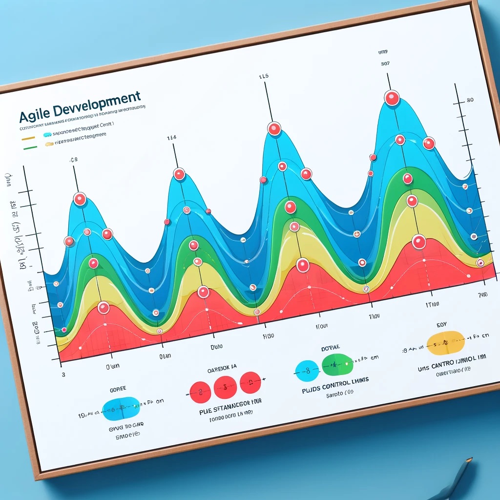
Control charts, at their core, are a form of statistical process control. They help us visualize the process data over time, distinguishing between normal process variation and deviations that might signal a problem. In agile development, where rapid iterations and continuous improvement are key, control charts provide a clear picture of sprint performance, cycle times, and other key process indicators.
Identifying Outliers in Agile Metrics
Outliers in a control chart can signify that something unusual is happening within your agile processes. These could be exceptionally long cycle times or unusually quick completions of user stories. To identify these outliers, we look for data points that fall outside the control limits on the chart, typically set at plus or minus three standard deviations from the mean. This method ensures that we're focusing on significant deviations that could indicate issues like resource bottlenecks, scope creep, or unexpectedly smooth operations.
Setting the Standard Deviations
The choice of standard deviation in control charts is pivotal. In agile development, where flexibility and adaptability are valued, setting too narrow a control limit can lead to frequent false alarms, whereas too wide a limit might overlook important signals. Generally, ±3 standard deviations form a balanced threshold, capturing roughly 99.7% of all data points assuming a normal distribution. This setting helps in maintaining a focus on significant anomalies that are worth investigating.
Actions to Take Once Outliers are Identified
When outliers are detected, the immediate step is not to jump to conclusions but to investigate. Here’s how I typically approach it:
- Root Cause Analysis: Engage the team to discuss potential causes for the anomaly. Tools like the Five Whys or fishbone diagrams are particularly useful here.
- Adapt Processes: Depending on the identified causes, we may need to adjust our processes. For instance, if a bottleneck at a testing phase is causing delays, perhaps we need to reallocate resources or adjust our sprint planning.
- Continuous Monitoring: After adjustments, it's crucial to keep an eye on subsequent sprints' data to ensure the changes have the desired effect.
- Feedback Loops: Regular retrospectives with the team can help in understanding the impacts of any changes and provide continuous feedback, which is essential for agile teams.
Conclusion
Incorporating control charts into agile development isn't just about tracking metrics—it’s about creating a culture of continuous improvement and responsiveness to change. These charts enable us to visualize our project dynamics clearly, identify outliers effectively, and take informed actions based on data-driven insights. By adopting control charts, we empower our teams to deliver better, faster, and with higher quality, ultimately enhancing our project outcomes and customer satisfaction.
As we continue to navigate our agile journeys, let’s leverage the power of control charts to turn data into actionable intelligence, ensuring our processes are as efficient and effective as they can be. After all, in the agile world, our aim is always to adapt and improve, and control charts provide the clarity needed to do just that.